

BLERDON SOPAJ L.L.C
Blerdon Sopaj is a professional personal trainer with a clear vision: build a brand that hits as hard as his training does. The brief was simple — create a visual identity that communicates power, discipline, and results without looking like every other fitness brand out there.
We built the entire identity around three words that define his philosophy: Power. Discipline. Progress. The logo uses Akira Expanded Super Bold — a typeface chosen specifically for its bold geometry, athletic structure, and forward energy. Every letterform feels earned.
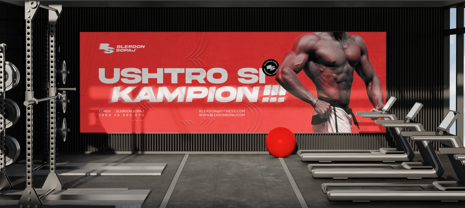
The color system is built on two anchors: an power red for energy and urgency, and a carbon for authority and focus. No gradients. No softness. The palette is intentional and uncompromising exactly like the brand it represents.
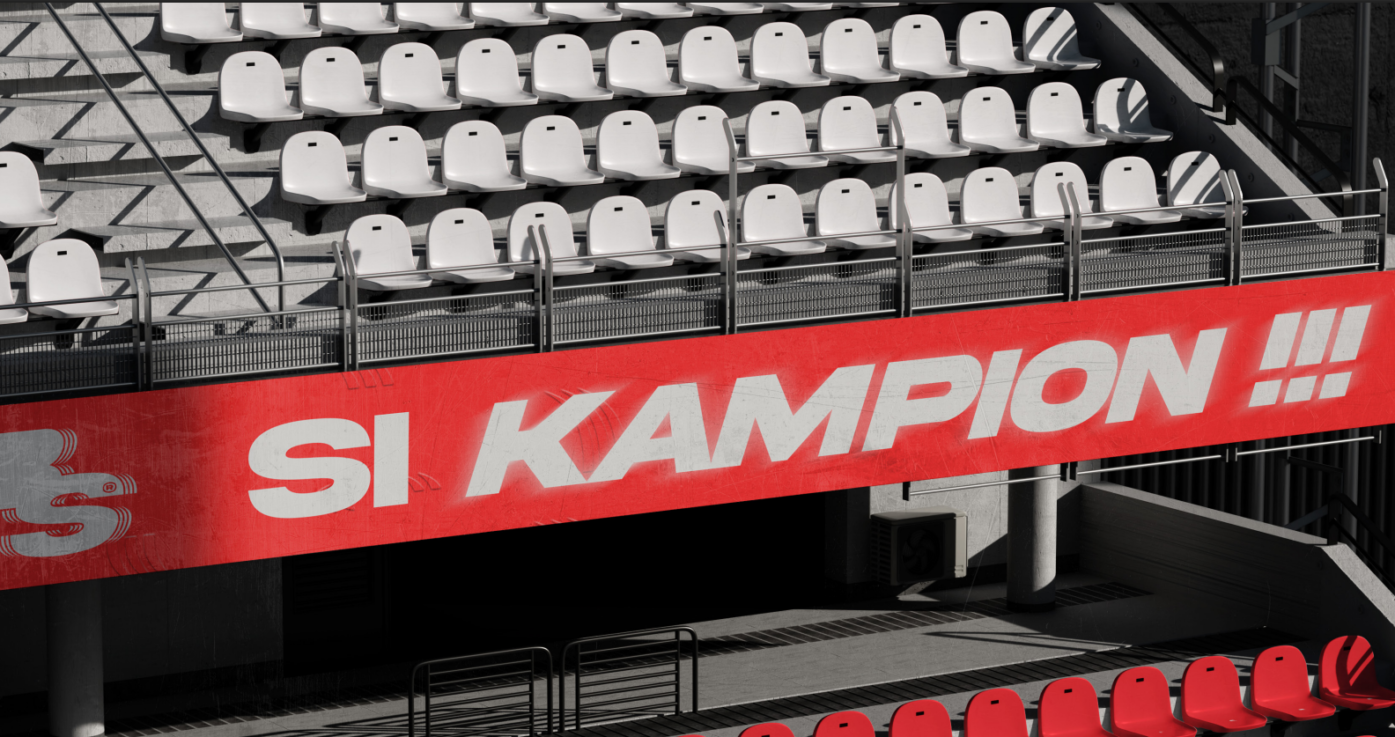
The identity system extends across every touchpoint: stadium banners carrying the rallying call “Si Kampion”, gym wall displays, branded nutrition packaging, Apple Watch faces, social media creatives, and apparel — including a full oversized t-shirt design featuring the BS monogram alongside the brand pillars: Power. Mass. Strength. Movement. Speed.
Boostonic understood exactly what I wanted before I could even fully explain it. The result is a brand that feels like me, powerful, focused, and built to win.